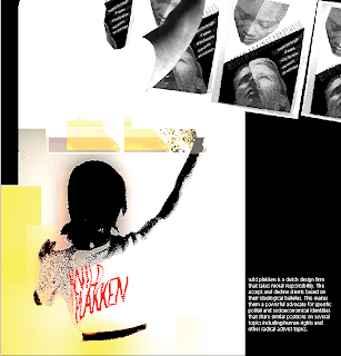
The hope for this refinement was to make the ethos a more obvious reference to the original Wild Plakken poster. This little addition to the collage also gives a little more clarity to my own visual construction. There is a new type box that gives just a little background information on the design firm.
I am probably going to use this Type-aesthetic for my resume, played down to a more professional and conservative tone. But I do think it is a consistent quality that has been present in my work and so I think it is an appropriate implication in my visual identity.

